
The modern Olympics began in 1896 as a way to convey the spirit of their classical counterparts from ancient Greek times. Only fourteen nations participated in those games that were held in Athens, Greece—mostly European states along with the United States, Australia, and Chile. Since 1896, the games have been played every four years with the exception of cancellations in 1916, 1940, and 1944 due to the first and second world wars. By the 2012 London games, the number of particpating nations had increased to 204. The winter and summer games now occur with two year gaps. Host nations have included countries in North America, Asia, Europe, and Oceania with South America hosting a first in the summer of 2016.The iconic Olympic rings were designed in 1912 by Pierre de Coubertin, the co-founder of the modern Olympic Games. In the 1912 edition of Olympique, Coubertin stated that the symbol: “…the six colors [including the flag’s white background] thus combined reproduce the colors of all the nations, with no exception. The blue and yellow of Sweden, the blue and white of Greece, the tri- colors of France, England and America, Germany, Belgium, Italy, Hungary, the yellow and red of Spain next to the novelties of Brazil or Australia, with old Japan and new China. Here is truly an international symbol.”The Olympic Rings are one of the most recognized “brands” in the world, and their success can widely be attributed to the express goal of incorporating something with great significance but also visually simple. Yet it is the Olympic logos of the individual games that allow for the host nations to best project a symbol of their culture and traditions.The introduction of Olympic logos for each game began ninety years ago with the 1924 Paris games. The logo harkens to the classical past of the games by incorporating an ancient Greek ship with a hint of national pride in the form of two fleur-de-lis. The 1928 Amsterdam Games introduced a logo in the form of a stylized word mark. Other Olympic Game logos have included symbols of national pride such as the London 1948 games that incorporated Big Ben and Parliament into the logo and Barcelona’s 1992 logo that comprises the colors of the Spanish flag as well as the artistic style of Joan Miró.The Sochi 2014 logo is significant for being the first word mark logo since the Mexico City 1968 games. It is also the first logo to incorporate an Internet domain with the use of “.ru”. Sochi’s brand identity was created by Interbrand and more can be read about the vision behind the logo here. YPPS wishes all Yalies particpating in the games best of luck! To learn more about a project related to the Olympics that we completed for Yale Athletics please click here. Take a tour of the Olympic logos over the course of the last 90 years below.-By Christian Vazquez ‘13
- Main Menu
- Sub Menu
-
Products & Services
Apps & Digital Publications
 YPPS develops customized apps for all mobile platforms. We will meet with you to determine your exact needs and develop your app from the ground up. Contact YPPS Customer Support for more information.
 -
BluePrint Copier Rental
 The YPPS BluePrint Team manages the Copier Rental Program and the PaperCut Program, we customize our services based on your specific needs.
 -
Promotional Solutions
Promotional Solutions from YPPS
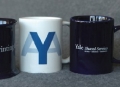 Over the last 25 years, YPPS has been able to procure and provide top quality custom specialty items and more to the Yale community. With a dedication to quality, turnaround, and cost, our Promotional Items & Solutions department has partnered with local Yale-approved vendors to produce all of our products. We take pride in knowing that we can facilitate these projects with great service and quality.
Please use these web pages as a guide to better understand how we can help you with your promotional events and projects.
For options, specifications, and cost estimates, contact us by calling or emailing:
Edward Van Keuren @ 203-432-7076 edward.vankeuren@yale.edu
Carmen Cusmano @ 203-432-3540 carmen.cusmano@yale.edu -
About YPPS
YPPS Mission
 YPPS is dedicated to supporting the University’s evolving media needs both educational and administrative with excellent customer support, resourceful solutions and indispensable services.
Questions? Contact Us Here